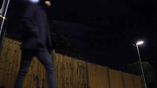
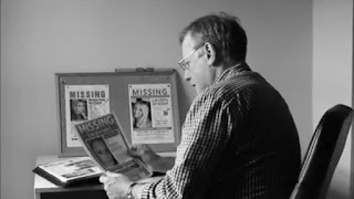
We had a vast response in terms of feedback to our production, ‘Love Me’. The majority of the reviews and feedback we received were positive but we still proceeded with minor changes to create two drafts before a final completed trailer. These drafts were the direct consequence of criticism left on our trailer or blog. I feel the feedback was vital in crafting our final trailer for ‘Love Me’, enabling us to strive for a well-rounded trailer, utilising conventions to maximise the standard outputted into our product. The feedback was grasped from a range of source, from classmates to teachers. Valuable feedback was received from Mr Noble, who is heavily involved with the film industry as well as teaching at the academy. His feedback greatly influenced our final product as he has first-hand experience and knowledge with trailers and the movie industry.
Film Trailer
In terms of the trailer, we received a lot of positive
feedback, this included the following…
Pacing.
Generally, thriller trailers follow a specific layout in
terms of pacing. They begin slowly and reach a high pace after encountering the
dilemma and unbalancing the equilibrium. This was evident within our project,
as the audience felt this was clearly portrayed. The fast pace was described as
“pulse raising” and to really encaptivate the audience.
Scream.
This feedback was towards the scream at the end of the
trailer in which then fades to darkness. The feedback stated that the scream
coupled with the fade added suspense and a range of unanswered questions
surrounding Rosey and the narrative.
Thunder.
The audience replied positively in reaction to the thunder
sound effect which continued from the knife drop scene and into the next. This
emphasised the impact of the drop, and the thrilling nature of the narrative.
Camera Shots.
 Our vast range of camera shots and angles was praised widely
by the audience. The low angle shot of Henry walking was particularly
highlighted as it really emphasised his role within the film, depicting his
character as dominant and powerful. When compared to the high angled shot of
Shania tied up, this really demonstrated the contrasted a roles and
conspicuously presented the narrative of ‘Love Me’.
Voiceover.
The voiceover was often referred to within our feedback, as
the deep tone was described to provide a vital dark tone towards the film’s
narrative. The deep tone of the antagonist’s voiceover presented the sinister
and dark nature of his intentions and actions within the narrative.
Editing.
The professionality of our editing was praised due to the
sharp editing and free-flowing nature of the trailer. The effects and
transitions really helped to smooth over the trailer, presenting a fluid
professional trailer.
However, our trailer was not perfect, especially within the
preliminary drafts. We received the following criticisms…
Voiceover.
Originally the trailer featured no voiceover, therefore, the
lack of non-diegetic sound within the trailer was criticised. After adding a voiceover,
it was labelled as too light and did not fit the sinister agenda of the
kidnapper. Furthermore, the addition of
a female voiceover to provide both sides of the narrative was suggested.
Therefore, after considering all this constructive criticism, we deepened the
tone of Henry’s voiceover through the use of a filter and added the voiceover
of Rosey (Isa Cusick-Knight).
Subtitles.
The earliest of subtitles are criticised for featuring
spelling mistakes and poor grammar. However, these were easily altered to
maximise the trailer’s impact and present the project in a professional manor
at the highest possible standard.
Casting.
In the trailer’s earliest form, Aaron Hayes featured as the
Detective. However, the audience provided vital feedback in that his
characteristics did not portray the film as realistic. Aaron’s poor acting
skills and relatively young age were primarily criticised. Therefore, we
decided to re-cast the role of the detective and re-film the scenes with
George, Henry’s Step-Father. In comparison to Aaron, George had much greater
acting experience and was much older, which presented a realistic detective.
Chronology.
Within our first draft, the trailer was often criticised for
being chronological, providing a short film rather than a trailer. Therefore,
we had to re-film, to create a vast selection of clips and provide a new
timeline for the trailer. In doing so, we created a higher standard trailer
filled with content but not conceding the film’s narrative despite giving off
hints.
Effects.
Our first two drafts were labelled one dimensional by those
who viewed it. The lack of transitions, effects and filters were highlighted
and was hindering the trailer’s potential. After receiving this feedback, we
really explored all areas of iMovie, utilising various effects, including the
sepia filter.
Stage 1
Upon being presented to our teachers, the second draft was
exposed to various areas of criticisms. Primarily, the lack of effects used
within the trailer was pinpointed. Also, the transitions were not fluid, and
the trailer lacked intensity. In response
to the lack of effect feedback, we decided to overhaul the beginning of the
trailer, and add a series of effects to give a professional look to the
trailer. For example, we used the dream effect on iMovie which distorted the
image of the protagonist. This was used to reflect the distorted mind of the
protagonist and the mental confusion they faced.
Stage 2
 The second stage of the production involved a drastic
overhaul of the production, centred on the role of the detective. After receiving
reasonably negative feedback surrounding Aaron’s casting as the detective, we
felt it would be best for the project to recast and refilm the detective’s
scenes. Aaron was criticised due to his poor level of acting and his age in
relation to the role, with a 17 year old not best fitted to playing a
detective. We opted to remove Aaron from his on screen role, and cast George,
an experience actor who is much older. This enabled us to portray
verisimilitude as he fitted the detective role unlike our previous trailer
which featured Aaron.
Stage 3
After collating the feedback, we decided the next area in
need of improvement was the title screens. We share the first draft amongst our
classmates then teacher, the feedback we collected was fairly negative. The title
screens were described to be unclear and contained poor grammar. To highlight
this, the title screens read, “Some are not destined to be” followed by, “For
others there is no choice”. The message we were trying to portray was being
blurred by the poorly worded titles, and therefore we decided to overhaul the
titles. We replaced the titles with “Love may be for some…” and “But not for
all”. By referring to love, this clearly translated the narrative of the film
towards the audience, removing any confusion. This presents the motives of the
kidnapper for the audience.
Stage 4
The penultimate change we made was the voiceover. In the
original draft of the trailer, we featured no voiceover. The feedback we
received fuelled us to add the voiceover for Henry, as we lacked sound in large
portions of the trailer. After introducing the voiceover into the second draft,
feedback was yet again critical. The voiceover was deemed too light for the
production, and the suggestion of an additional voiceover was proposed. In our
final trailer, we altered Henry’s voiceover, deepening the tone of his voice to
represent his characters sinister and dark intentions. We added the voiceover
from Isa to present verisimilitude as it is portrayed as a emergency services
call. This provides both sides of the narrative.
Stage 5
The final change surrounds the chronology of the trailer.
Originally our trailer was labelled a short story rather than a trailer as it
was chronologically correct and conceded large proportions of the narrative. Therefore,
we had to install the teaser element of the trailer through a series of
changes. This begun with filming a collection of new scenes which we then
followed with a complete overhaul of the trailer’s timeline. By introducing the
discontinuity and manipulating the plot, the ‘story’ interpretation of the
trailer was lost.
Film Poster
Positive feedback:
Images.
The use of my three images was praised due to it providing
vital information of the narrative. The poster presented the two key
characters, the kidnapper and Rosey as well as the location/setting. Furthermore,
I used a red filter across all images to present the sinister tone of the movie
and reveal

the thrilling element.
Text.
Within the poster, I ventured away from the standard
Microsoft fonts, and discovered a wide variety at 1001fonts. Here I opted for
the ‘Ringbearer’ font which I found underneath the Hollywood category within
the website. The font features sinister curves with sharp edges, portraying the
actions of which the kidnapper commits. Furthermore, I wanted my poster to
appear professional, and as this font was located under the Hollywood category
it seemed very fitting, this was reflected within my positive feedback.
Colour.
The colour scheme was positively received as I opted for
dark red and black across the whole poster. These two colours often connote
evil and darkness, which is how the kidnapper would be described. By using such
colours, the genre of the film is conspicuously translated across to the
audience.
Negative Feedback:
Reviews.
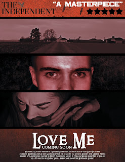
My poster did not feature any reviews from newspapers or
magazines. Therefore, my poster was deemed to be lacking certain professional elements.
As a result, my poster did not receive all positive reviews. However, in
response I simply added a review at the top of the poster, labelling the
production a masterpiece.
Stage 1
My first and final stage was to introduce a review into the
poster. In doing so, this created a well-rounded poster, and really completed
the product. This enabled me to generate a professional product and ultimately
provided that ‘Hollywood’ appearance I was searching for. The review labelled the
production as a masterpiece and rated ‘Love Me’ as a 5 star film by The Independent. The two images featuring to the right depict this minor change.
Magazine Cover
Positive Feedback:
Text.
As a result of my discovery of 1001 fonts, the range of
fonts I used was commonly praised across my feedback. The used of ‘American
Captain’ was highlighted, as the bold text really captivated the reader and
caught the attention of my classmates. Therefore, I opted to use this font for
my magazine name “Final Cut”. Also, the use of “My Bleeding Scars” for the
Delirium was praised as it was really unique in comparison to the fonts
Microsoft has to offer and connoted that the movie would be from
the horror
genre.
Main Image.
My main image was positively received, due to the large size
of it and the direct gaze used. When capturing the photo, I asked Henry to
directly stare down the lens to captivate the reader, and draw them in.
Film Reel.
I used a film reel to crop smaller images and promote the
contents of the magazine. The play on the film reel was positively received
alongside my creativity. By featuring the reel, this clearly translated what
the magazine had to offer.
Negative Feedback:
Space.
Initially, my magazine lacked text, featuring large areas of
space. This was pinpointed by my teachers as the chief reason my magazine could
not be viewed in professional manor. The space was also due to my small text, which
needed to be increased in size as my range of fonts was positively received.
Barcode.
Within my first draft, my magazine did not feature a
barcode. This was a finishing touch that was necessary in presenting a
professional product. This was highlighted as the viewers to be restricting the
standard of the magazine, and preventing a well-rounded product.
Stage 1
After collating the feedback, the chief reason for concern
was the large amount of space. This needed filling by increasing font size and
adding additional text. To do so, I increased every current font and added the
additional film title of “Skeng”. Furthermore, in response to the negative
feedback, I opted to add a splash of yellow paint printed over with “Winter
2016 Review”. In doing so I added the finishing touches to create a complete
product.
Stage 2
The final area for improvement was to add a barcode. To
create the barcode I used the rectangular tool alongside the standard Arial
font to generate the numbers. By adding this to the bottom right of my
magazine, this presented the product as whole and gave a professional
appearance.


Comments
Post a Comment